
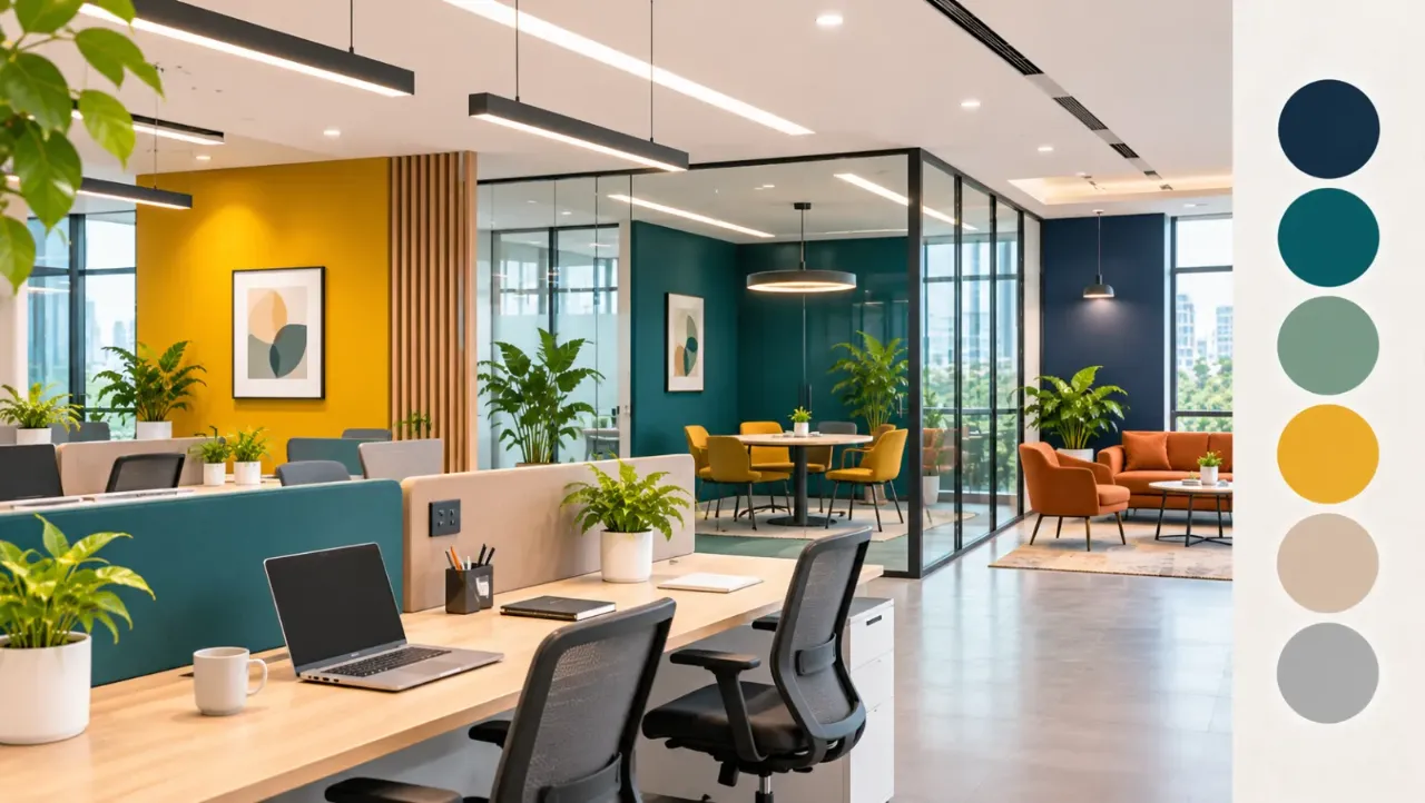
Office Colour Palette: Balancing Branding and Focus
An office is more than a collection of desks, meeting rooms and workstations. It is also a physical expression of a company's identity. From the reception area to the conference room, the colours used in an office influence how the space looks, feels and communicates with employees and visitors.
This is why choosing an office colour palette can be more complicated than simply matching the walls to a company logo. Brand colours help create recognition and a consistent visual identity, but using them everywhere may make the workplace feel visually overwhelming. On the other hand, choosing only neutral shades can make an office look professional but disconnected from the brand.
The ideal approach is to create a balance: use colour to communicate the company's personality while keeping everyday workspaces comfortable and visually organised.
1. Understand the Difference Between Branding and Focus
Branding and focus serve two different purposes in office design.
Branding is about communicating the organisation's identity. Colours, finishes and visual details can make the workplace feel connected to the company's values and personality. A creative agency, for example, may want a more expressive environment, while a financial or legal office may prefer a restrained and formal appearance.
Focus, meanwhile, is about creating an environment where employees can work without unnecessary visual distractions. This does not mean every office should be white or grey. It means choosing colours thoughtfully, considering their intensity, placement and the activities taking place in each area.
A successful office palette should support both objectives instead of allowing one to dominate the other.
2. Start With the Company's Brand Colours
Before selecting wall paints, furniture finishes or decorative elements, identify the company's primary and secondary brand colours.
Look at the logo, website, stationery and other brand materials. Identify which colours are essential to the visual identity and which can be used more flexibly.
However, a brand colour that works well on a website or business card may not be suitable for an entire office wall. A highly saturated shade can appear much stronger when applied across a large surface.
Instead of reproducing the brand palette exactly, consider adapting it for the physical environment.
- Use the primary brand colour in reception signage or a feature wall.
- Introduce secondary brand colours through furniture, artwork or meeting-room details.
- Use lighter or muted versions of strong colours where larger surfaces need colour.
- Keep the remaining finishes coordinated with the brand rather than matching every element directly.
This approach keeps the workplace recognisable without making it feel like an oversized advertisement.
3. Use Neutral Colours as the Foundation
Neutral shades provide a visual foundation for an office. They allow brand colours to stand out while helping the overall environment feel balanced.
Common choices include:
- Warm white for a clean and welcoming appearance.
- Soft beige for a warmer alternative to plain white.
- Light grey for a contemporary and understated look.
- Greige for a balance between warm and cool tones.
- Muted taupe for a more sophisticated finish.
Neutrals can be used across larger surfaces such as walls, ceilings, workstation panels and storage units. They also make it easier to introduce new furniture or update accent colours in the future.
A neutral base does not have to look plain. Texture, lighting, flooring and material combinations can add depth without introducing too many competing colours.
4. Choose Colours According to Office Zones
An office does not need to follow exactly the same colour intensity in every area. Different zones support different activities, so the palette can change subtly from one space to another.
Reception and Entrance
The reception area is often the first point of contact for clients, visitors and new employees. It is a suitable place to introduce the brand more prominently.
Consider using the primary brand colour in the reception backdrop, signage, artwork or selected furniture. Pair it with restrained flooring and wall finishes to keep the space professional.
Open Workstations
Workstations are used for extended periods of concentration. A calm, low-contrast palette is usually a practical choice for these areas.
Use neutral walls, understated desk finishes and limited accent colours. If the brand colour is particularly bright, introduce it through small details rather than covering large surfaces.
Meeting Rooms
Meeting rooms need to feel professional while supporting discussion and collaboration.
A neutral base with one or two stronger accents can work well. Brand colours can appear in upholstered chairs, wall graphics or selected decorative details.
For rooms used for presentations, also consider screen visibility, glare and the contrast between the presentation display and surrounding surfaces.
Breakout and Collaboration Areas
These areas can accommodate more expressive colour choices than individual workstations.
Use a stronger accent wall, colourful seating or artwork to create a visual distinction. The palette should still relate to the overall office design so that the space feels connected rather than unrelated.
Private Cabins and Focus Rooms
Private work areas and focus rooms benefit from a visually restrained scheme. Soft neutrals, muted colours and limited decorative contrast can help create a quieter atmosphere.
The aim is not to prescribe one colour for concentration, but to avoid excessive visual stimulation in spaces intended for uninterrupted work.
5. Understand How Different Colours Affect the Space
Colour associations are not universal. They can vary with culture, personal preference, lighting, surrounding materials and the shade being used. Still, certain colour families can help establish a particular visual character.
Blue
Blue is commonly associated with professionalism and stability. Muted blue tones can work well in meeting rooms, private cabins and selected workstation areas.
Green
Green often brings a natural, relaxed quality to interiors. Sage, olive and muted green shades can be paired with timber, beige and warm neutrals.
Yellow
Yellow can make a space feel lively and energetic. However, bright yellow may become visually dominant when used extensively. Softer yellow tones or small accents are often easier to incorporate.
Orange
Orange adds warmth and visual energy. It can be used in breakout spaces, collaboration zones and selected feature elements.
Red
Red is a strong, attention-grabbing colour. Rather than using it across large office surfaces, consider small applications in signage, artwork or brand-related details.
Grey and Beige
Grey and beige provide versatile backgrounds for different office styles. Their appearance depends on the undertone, lighting and materials used alongside them.
The important consideration is not to assign a productivity benefit to a colour automatically. Test the actual shade in the intended space before finalising it.
6. Build a Balanced Office Colour Palette
A practical way to organise an office palette is to divide it into three layers:
Base colours: These form the majority of the visual environment. They can include white, beige, grey, taupe or other restrained shades.
Supporting colours: These add character and connect the base palette with the company's identity. They may include muted brand colours, natural greens or softer blues.
Accent colours: These are used in smaller quantities to create visual interest. They can appear in signage, artwork, furniture, feature walls and accessories.
For example, an office with a deep blue brand identity could use:
- Warm white as the main wall colour.
- Light grey for workstation finishes.
- Muted blue for selected meeting-room walls.
- Deep navy for reception signage and smaller accents.
- Natural wood tones to add warmth.
This creates a recognisable brand presence without making every surface compete for attention.
7. Consider Lighting Before Finalising Colours
A colour sample can look different under daylight, warm artificial lighting and cool office lighting. A shade that appears soft in a paint catalogue may look much stronger or duller once applied to a large wall.
Before finalising the palette:
- Test paint samples on the actual walls.
- Observe the shades in both daylight and artificial lighting.
- Check how the colours look near windows and in areas with limited natural light.
- Consider the colour temperature of the installed lights.
- Review the combination with flooring, furniture and ceiling finishes.
Also consider glare and screen reflections. Glossy finishes and strong contrasts in the wrong locations can make workstations uncomfortable.
Testing colours in the actual environment is more reliable than making decisions from a digital palette alone.
8. Avoid Common Office Colour Planning Mistakes
Even a well-designed palette can become ineffective if it is applied without considering the scale and use of the space.
Some common mistakes include:
- Using the primary brand colour everywhere: This can make the office feel visually repetitive and overwhelming.
- Choosing too many accent colours: Too many competing shades can make different areas feel disconnected.
- Ignoring natural and artificial lighting: Colours may look very different once installed.
- Using high-contrast combinations across every surface: Strong contrasts can become distracting when repeated throughout work areas.
- Treating every department identically: Different zones may need different levels of visual energy and privacy.
- Selecting colours only from digital references: Screens do not reproduce paint and material colours accurately.
- Forgetting furniture and flooring: Wall colours should be selected as part of the complete interior palette.
The best results come from planning the colours together with the materials, lighting and layout.
9. A Practical Checklist Before Finalising the Palette
Before approving the office colour scheme, review the following:
- Does the palette reflect the company's brand identity?
- Are the strongest brand colours used selectively?
- Is there a neutral foundation for larger surfaces?
- Do workstation areas feel visually comfortable?
- Are meeting and collaboration spaces distinct without looking unrelated?
- Have paint and material samples been tested under actual lighting?
- Do furniture, flooring, walls and ceilings work together?
- Can the palette accommodate future changes in furniture or branding?
Involving employees or representatives from different departments in the review can also help identify practical concerns before the design is finalised.
Closing Thoughts
An effective office colour palette should do more than make the workplace look attractive. It should communicate the company's identity while creating an environment that feels comfortable for everyday work.
The most practical solution is to use brand colours strategically, build the larger surfaces around a coordinated neutral foundation and introduce stronger accents according to the purpose of each zone. With careful attention to lighting, materials and colour intensity, an office can feel recognisably branded without becoming visually overwhelming.
Explore More with Walls to Wonder
Planning an office or refreshing your workspace? Explore Walls to Wonder's AI-powered interior design tools to visualise ideas, understand costs and make more informed design decisions.
- Whole Home Visualizer
- Design My Room
- Interior Design Cost Estimate
- Interior Quotation Checker
- Rate My Room Design
- Interior Style Finder
Discover more ideas and inspiration at Walls to Wonder.
Turn this idea into a plan for your home
Visualise your space, understand the likely budget, or find a professional who can bring the idea to life.