
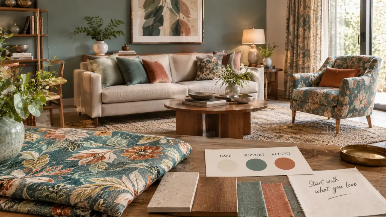
Start With the Fabric: A Smarter Way to Design a Room
Sometimes the best starting point for a room is not the wall, the sofa, the flooring or even the furniture. It is a piece of fabric. A curtain you found while travelling. An old handwoven textile. A printed fabric you could not stop thinking about. A cushion cover with colours you love. A beautiful textile that instantly makes you imagine a room.
Most people treat that fabric as an accessory. But it can do something much more useful.
Start by Asking Why You Love the Fabric
Before pulling colours from it, look at the fabric properly.
- Is it the main colour?
- Is it a small accent colour?
- Is it the pattern?
- Is it the softness?
- Is it the contrast?
- Is it the weave or handcrafted quality?
- Does it remind you of somewhere?
Your favourite part of the fabric should influence the part of the room that gets the most attention.
Treat the Fabric as a Colour Map
A patterned textile often contains more colours than you notice at first. There may be one dominant colour, one secondary colour and several smaller accent shades.
That gives you a ready-made palette.
Dominant Colour
Use it to understand the overall visual temperature and mood of the room.
Secondary Colour
A softened version can influence a wall, larger textile or selected furniture.
Accent Colour
Use smaller amounts through cushions, artwork, accessories or one focal piece.
Texture
Repeat its tactile quality through wood, woven surfaces, rugs, ceramics or upholstery.
Don't Make Everything the Same Colour
Imagine a fabric containing blue, beige and rust. The easiest response is blue walls, a blue sofa, beige curtains, rust cushions and rust artwork.
The room is technically coordinated, but it can also feel like the fabric has simply been enlarged across every surface.
The better approach is to let the fabric inspire the palette without dictating every surface.
Choose One Hero Use for the Fabric
A favourite fabric does not need to appear everywhere.
- A pair of curtains
- A statement armchair
- The upholstery of a window seat
- A bed throw
- A headboard
- Dining chair upholstery
- A group of cushions
- A Roman blind
Decide what the hero application will be. Once that is established, the rest of the room can support it rather than compete with it.
Pattern Needs Breathing Room
If the fabric is patterned, remember that pattern is visual energy.
Large florals, geometric prints, stripes, checks and traditional motifs all have a presence. That does not mean the rest of the room needs to become plain. It means the surrounding elements need to give the pattern enough breathing room.
Match the Scale, Not the Pattern
You do not always need to repeat the exact pattern of the fabric. Instead, think about scale.
A large floral textile might work with a small geometric cushion. A fine woven fabric could sit beside a larger sculptural texture. A bold patterned curtain could be balanced with a simple rug.
The patterns can be different while still feeling related because their visual scale is controlled.
Pull Colours From the Small Details
Sometimes the best colour in your fabric is not the obvious one.
A textile may look mostly beige but contain a tiny amount of olive. Or mostly blue with a trace of terracotta. Or primarily neutral with one unexpected burgundy thread.
Those small colours can become excellent accent shades because they already exist inside the fabric.
Let the Wall Support the Fabric
Once you have your hero textile, the wall colour becomes easier to choose.
You can choose a quiet neutral that lets the fabric stand out, pull a soft secondary colour from the textile or use a deeper wall tone to create contrast when the fabric itself is restrained.
Texture Can Be More Important Than Colour
A fabric-led room does not need to repeat the same colours everywhere. Sometimes the connection can happen through texture instead.
A linen-like textile could be paired with natural wood, woven baskets, textured plaster, a jute or wool rug, matte ceramics and soft upholstery.
The idea is to create a conversation between textures. The room feels connected without becoming visually repetitive.
Let the Furniture Stay Relatively Quiet
This becomes especially important when the fabric is dramatic.
A simple sofa can provide a calm base. A restrained bed can allow a patterned headboard to stand out. A clean-lined chair can let a beautiful upholstery fabric do the talking.
The goal is not to make every object interesting individually. It is to make the composition interesting.
Use the Fabric to Choose Accent Materials
Your textile can also suggest materials beyond colour.
A traditional woven fabric may work beautifully with warm wood, brass, cane or hand-finished surfaces. A crisp contemporary textile might pair better with black metal, glass or cleaner-lined furniture.
A soft boucle-like fabric may suit rounded furniture and tactile finishes.
This is where fabric becomes more than colour inspiration. It can influence the personality of the room.
Think About the Rest of the Home
A beautiful fabric-led room should still belong to the house.
You do not need to repeat the exact textile elsewhere. But carry something forward: perhaps the same accent colour, timber tone, metal finish or overall level of pattern.
Indian Textiles Can Be Especially Powerful Starting Points
Indian homes often already contain textiles with rich visual stories: handloom cotton, ikat, block prints, silk, linen blends, embroidered fabrics and traditional motifs.
A favourite Indian textile can bring history and personality into a room without requiring the entire space to become traditional.
A traditional textile can sit beautifully with contemporary furniture. A modern room can carry one handcrafted textile as its emotional centre.
You do not have to choose between “traditional” and “modern.” You can let the fabric provide the bridge.
What If the Fabric Is Very Bold?
A bold fabric does not automatically mean a loud room. It simply means the fabric needs a clearer hierarchy.
Start by deciding where it will appear. Then use quieter versions of its colours elsewhere. If it has several strong tones, pick one or two for supporting accents. Keep larger surfaces calmer.
What If the Fabric Is Very Subtle?
A soft neutral fabric may be beautiful up close but disappear in the room.
In that case, use its texture as the inspiration. Layer it with other tactile materials, add contrast through darker furniture, introduce one stronger accent and use lighting to reveal its surface.
Don't Forget the Floor
The floor occupies a large visual area. If your fabric is warm and colourful, a very yellow floor may push the whole room too warm. If the fabric is cool and muted, an overly orange wood tone can compete with it.
You do not have to make the floor match the fabric. You simply need to understand how the two sit together.
Curtains Are Not Always the Best Place for the Fabric
Curtains are one of the most obvious choices, but they are not automatically the best one.
A delicate fabric might have more impact as a headboard. A small patterned textile could become cushions. A highly tactile fabric might be better used on one statement chair.
Choose the application based on the scale and character of the fabric, not just what is traditionally expected.
Build the Room Outward From the Hero Fabric
Identify its dominant, secondary and accent colours.
Decide where the fabric itself will appear.
Choose the main wall and large furniture colours.
Select supporting materials.
Add smaller accents.
Bring in décor last.
If you buy everything independently first, the fabric becomes one more item that has to “fit.” If you start with the fabric, the rest of the room has a visual reference from the beginning.
One Fabric Does Not Mean One Pattern Everywhere
Another common mistake is trying to create coordination by repeating the same pattern.
Instead, repeat the idea, not the exact pattern.
If the fabric introduces an organic floral feeling, perhaps the artwork has softer organic shapes. If it has a geometric rhythm, perhaps the furniture introduces cleaner lines. If it has a handcrafted texture, perhaps another material carries a similar tactile quality.
Use the 60-30-10 Idea Carefully
60% — Background
Walls, major flooring or large neutral furniture.
30% — Supporting Layer
Secondary upholstery, curtains, rugs or larger accents.
10% — Hero Accent
The favourite fabric and sharper supporting accents can sit here.
Think Hierarchy
The proportions do not need to be mathematical. The useful part is deciding which colour should speak first.
What Makes the Room Feel Personal?
The biggest advantage of starting with a favourite fabric is emotional.
A room built around a generic trend may look current. A room built around something you genuinely love is more likely to feel like yours.
Maybe the fabric belonged to your grandmother. Maybe you found it on a trip. Maybe it reminds you of your childhood home. Maybe you simply love the colours.
That personal connection is difficult to manufacture with a mood board.
The Fabric Is the Beginning, Not the Rulebook
Starting with a fabric does not mean the entire room has to match it.
It means the fabric gives you a direction. It tells you which colours already work together. It suggests a level of pattern. It may suggest a material mood. It can help you choose between warm and cool finishes.
But you still need to edit.
Some colours should stay out. Some patterns should stay small. Some materials will clash. Some parts of the room should remain deliberately quiet.
Before You Buy Anything, Make a Mini Palette
Lay the fabric out with a few supporting samples: a wall-colour sample, a wood or furniture finish, a floor sample, a curtain or upholstery option, a metal finish and a rug or accent colour.
Look at everything together.
You are not trying to make every sample identical. You are checking whether the combination feels balanced.
If one element immediately looks disconnected, change it before it becomes a purchase.
The Best Rooms Often Start With One Thing You Love
A room does not always need a grand design concept. Sometimes it needs one excellent starting point.
A fabric. A painting. A rug. A chair. A piece of furniture. Something that already contains the emotional and visual direction you want.
The fabric-first approach works because it turns that single object into a design tool.
Final Thought
Your favourite fabric does not have to stay in the category of “decor.”
It can become the reason the entire room works.
Use its colours to build the palette. Its pattern to guide visual hierarchy. Its texture to inspire materials. Its character to shape the mood.
And then stop before you start matching everything to it.
The goal is not to create a room that looks like the fabric. It is to create a room that feels like the fabric belongs there.
Ready to Visualise the Room?
Walls to Wonder's Design My Room tool can help you explore how different colours, furniture and styling directions might work with your existing space.
Once you have a clear visual direction, you can also explore interior professionals through the Walls to Wonder designer directory.
Frequently Asked Questions
1. Can I really design an entire room around one fabric?
Yes. A fabric can provide colour, pattern and texture cues for the rest of the room. It works particularly well when you treat the fabric as inspiration rather than trying to match every element to it.
2. How do I choose wall colour from a patterned fabric?
Look at the fabric's dominant and secondary colours. A quiet neutral or a softened version of one secondary colour is often easier to live with than choosing the strongest shade for the walls.
3. Should I use the same fabric in multiple places?
Not necessarily. One strong application can be enough. Repeating it in smaller amounts can help create a visual connection, but too much repetition can make the room feel overly coordinated.
4. What if my favourite fabric has many colours?
Choose one dominant colour, one supporting colour and perhaps one small accent. You do not need to reproduce every colour from the textile throughout the room.
5. Can a traditional Indian fabric work in a modern room?
Absolutely. Traditional textiles can work with contemporary furniture and cleaner finishes. The contrast between old and new can actually become part of the room's character.
6. What if the fabric is very bold?
Give it a clear hero position and keep larger surrounding surfaces relatively calm. Use one or two of its colours as supporting accents rather than repeating every colour everywhere.
7. Can a neutral fabric be the starting point for a room?
Yes. In that case, let its texture, weave and subtle tonal variation guide the room. Contrast can then come from furniture, lighting, materials or one stronger accent colour.
8. How do I know whether the fabric actually works with my room?
Test it with real samples of wall colour, flooring, furniture finishes, upholstery and metal details in the actual room. Look at the combination in both daylight and evening light before making major purchases.
Turn this idea into a plan for your home
Visualise your space, understand the likely budget, or find a professional who can bring the idea to life.